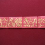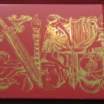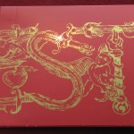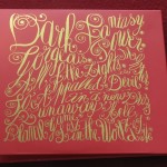


Kanye West’s My Beautiful Dark Twisted Fantasy is a modern masterpiece. It’s very rare that we get to witness the release of something great, but here we are. With all the grandiosity and scope of the album, it should come to no surprise the packaging matches the music. Kanye has always been obsessed with high class art and fashion. And it really shows on this. The gold font pops out against the red, the font itself is stunning. The coolest aspect of this release is the picture frame on the front of the digipack that allows fans to switch out the art. And no, he doesn’t make you buy five different versions to get every art, they all come included. Although I should note this is for the Deluxe Edition. My only gripe is that he chose to censor the Phoenix art (not only the painting) but the art on the disc itself. Had the Phoenix art been the display art, this would have actually made sense. Seeing as he used the Ballerina art for the display, then why censor it? It’s inside the booklet. And if Kanye was trying to make a statement against censorship in America, why not just censor the Clean version which would have made a bigger statement. So, now everyone in the U.S. is stuck with the pix elated mess. Thankfully, the Phoenix art was not my favorite, and the other ones are stunning. But if you are pissed off about the censorship, I recommend you just import your copy.
Conclusion: Absolute buy. Not only is it one of the best albums to come out in the last 20 years, the packaging is also one of the most interesting to come out in the last 20 years. Kanye put a lot of care and attention into this one, and it really matches the greatness of the music. Easily his best packaging to date, this is worth a purchase (or two).