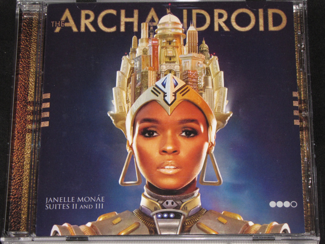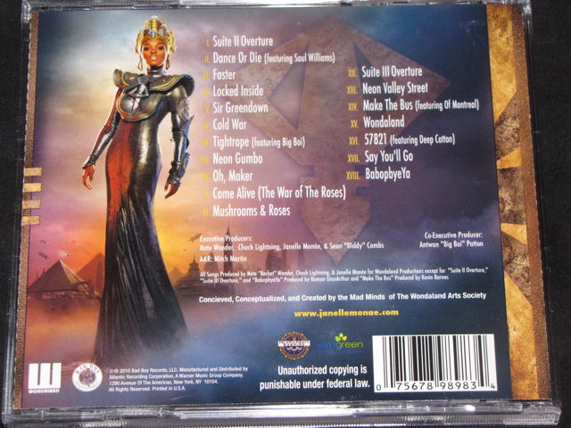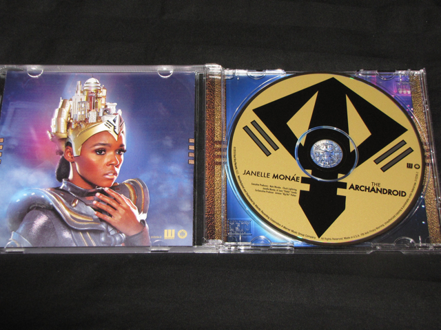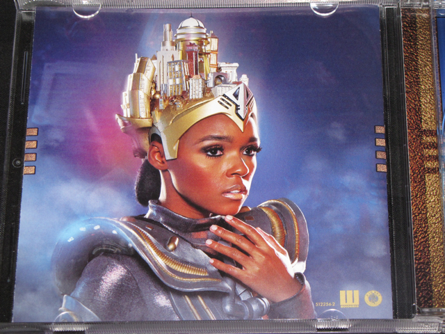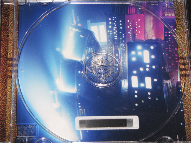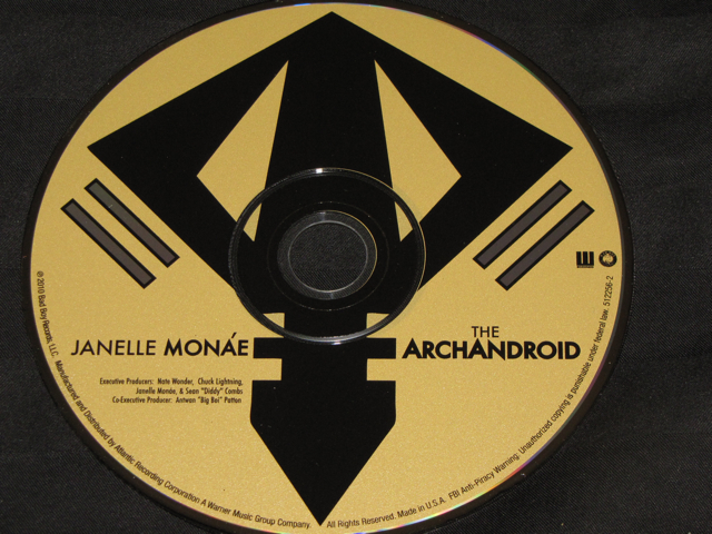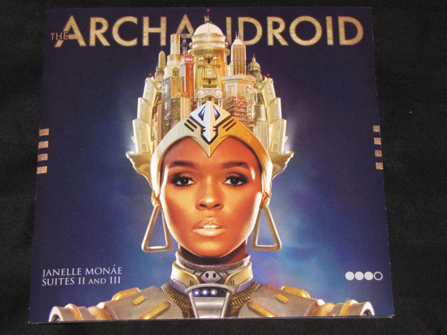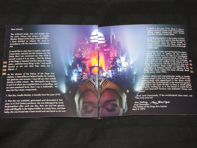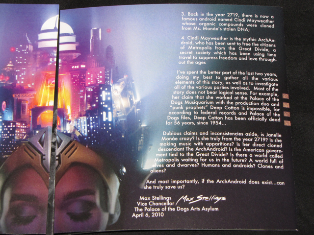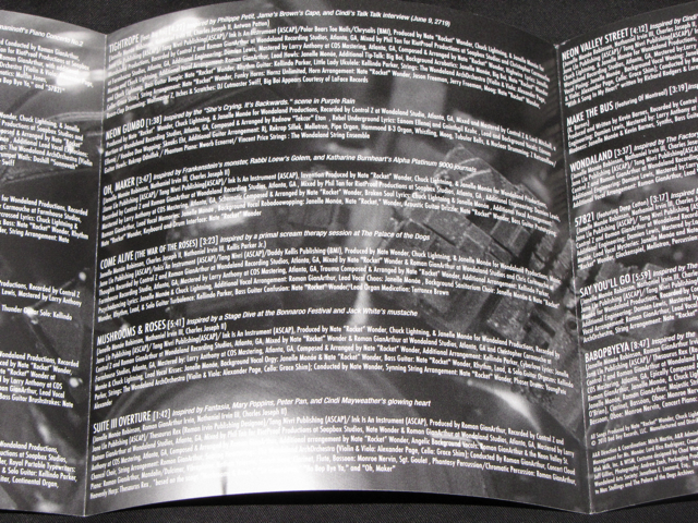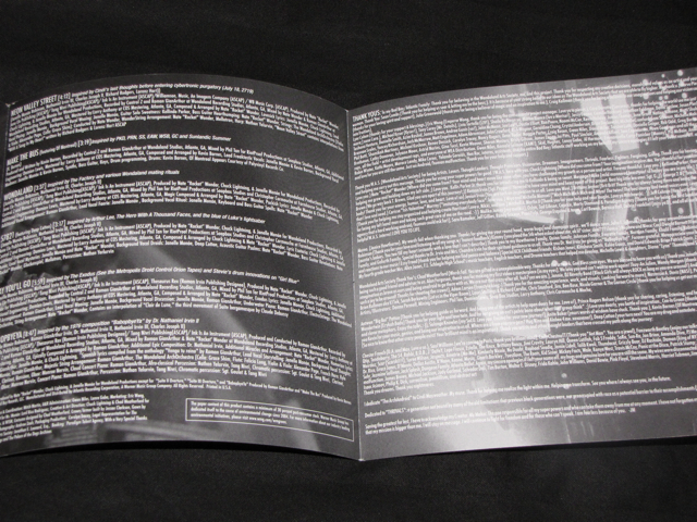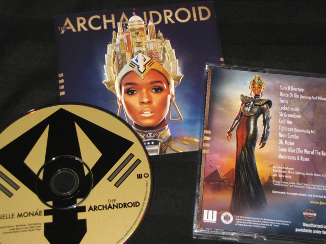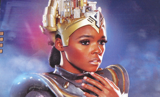

Janelle Monáe has created this magnificent world of fantasy and imagination with her latest album The ArchAndroid (Suites II and II). So this was the perfect opportunity to really have creative packaging to go along with the concept of the album. And I will say, what is there, is magnificent. Every picture goes well with the albums themes. Most notably, the colors are as vibrant and theatrical as Monáe herself. However, the lyric book folds out and in the inside is all the lyrics on a black backdrop. I really felt like this was a wasted opportunity to add more pictures. It would have been much preferred had they used a traditional book for the lyrics – and they could have used the extra space for more pictures. Seeing as Monáe is an up and coming artist, maybe she wasn’t given enough support when it came to the packaging. Especially given the fact most people don’t buy CD’s anymore. That said, I can’t recommend this album enough. It’s easily one of my favorite albums of 2010, and the packing really compliments the album well. Given that the lyric book is short, I would recommend the vinyl version of this album.
Verdict: I can’t recommend this album enough. However, if you have the choice between digital and physical, I wouldn’t say it’s 100% necessary to go with the physical. But you will be missing out on seeing the pictures in person, and they really jump out. My definitive pick is the vinyl version, for the quality of the packaging is amplified.