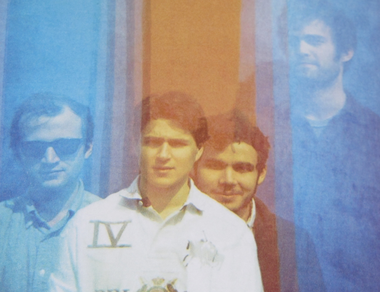
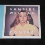
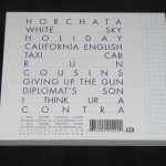
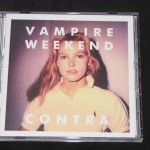
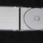
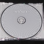
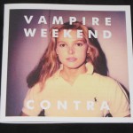
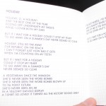
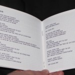
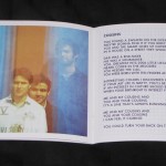
The album art for Contra is odd, but in some ways stunning. The packaging however doesn’t do enough to live up to it. For one, there are no pictures what so over besides one band picture. The lyric book is completely dull, just white graph paper with the lyrics. They even used the same graph design on the disc art. While this may have it’s charm to some, I think it’s baffling how an album with such an interesting art & sound has such a dull presentation.
Verdict: I would only recommend this if you can get it on sale. Definitely not a full price purchase. If you are going to buy it go with the LP version for the art.

