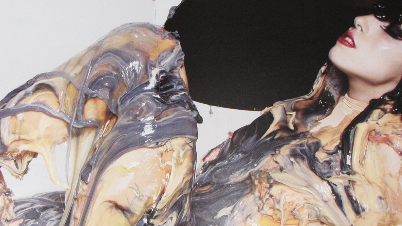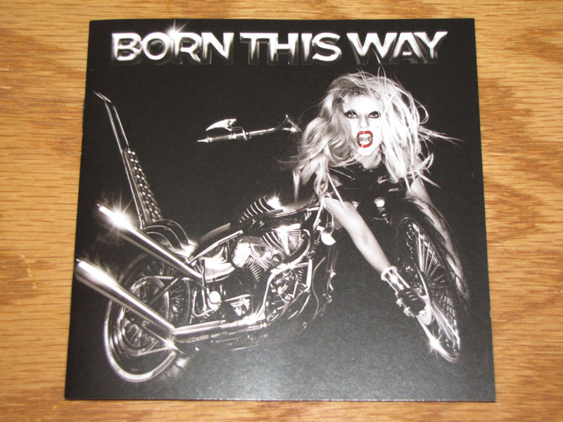

When Lady Gaga originally revealed the album art for Born This Way, I thought she was kidding. I mean, sure she’s worn a dress made out meat, and was even carried down the red carpet in an egg. But this had to be a joke. It wasn’t. In fact, Gaga would go on to explain the art was an homage to metal (one of her influences growing up) – and an allusion to the fact that she was evolving into something new (both figuratively and musically speaking). Even with the explanation, I was not very fond of it.
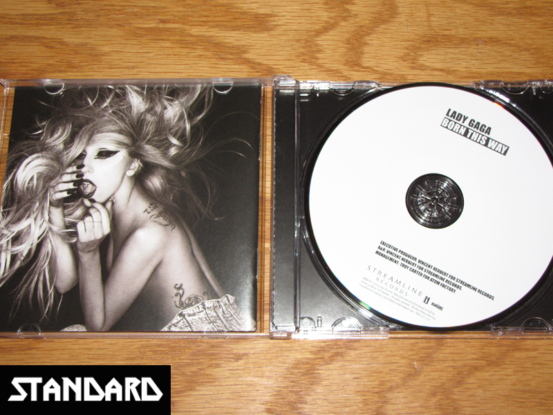
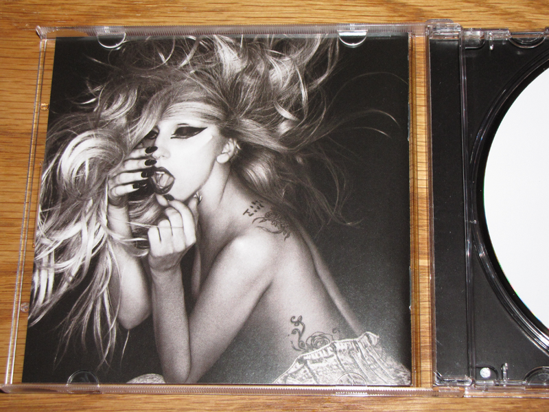
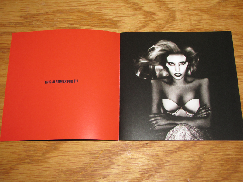
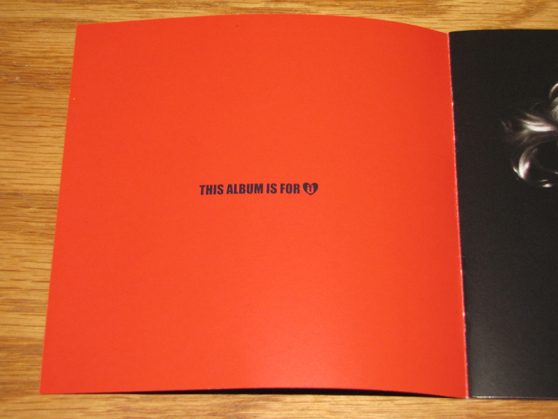
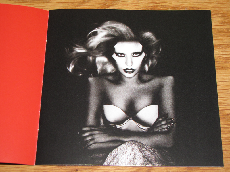
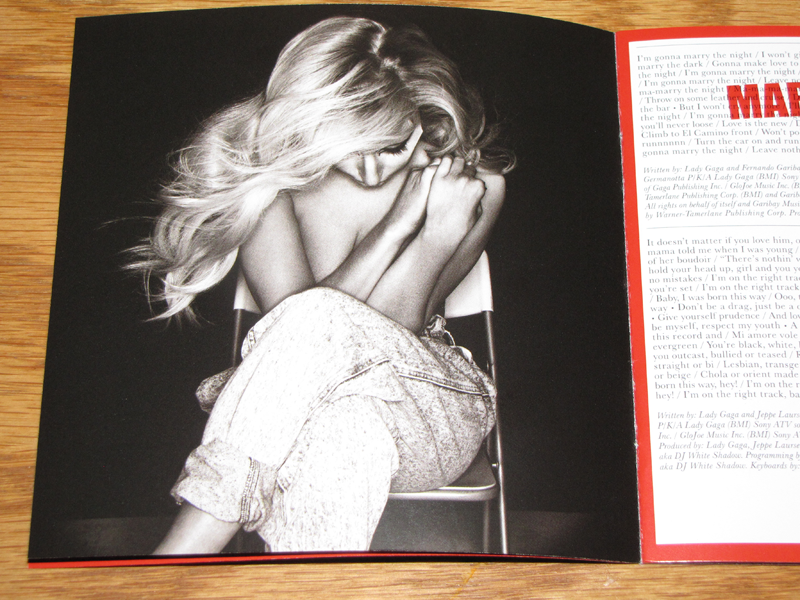
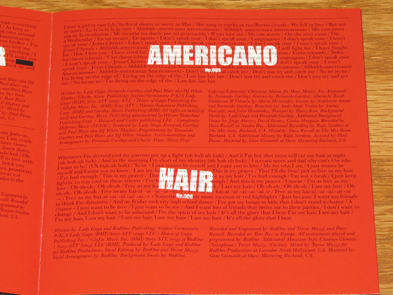
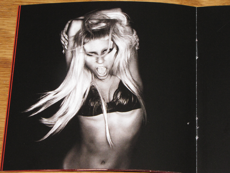
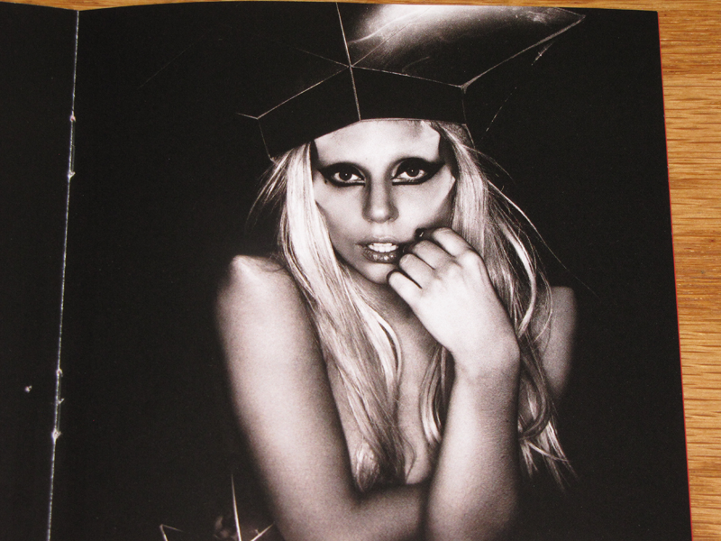
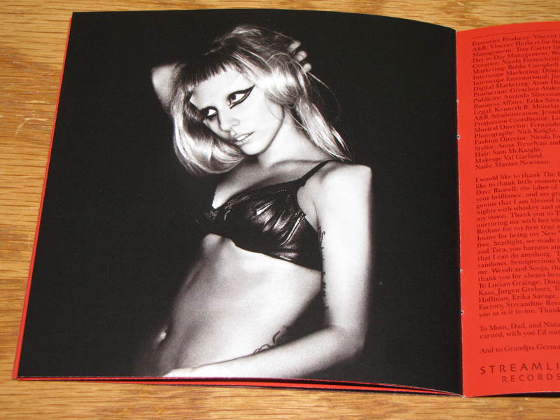
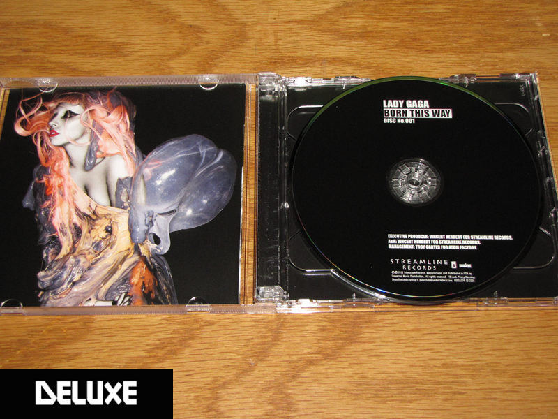
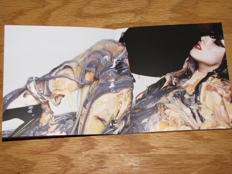
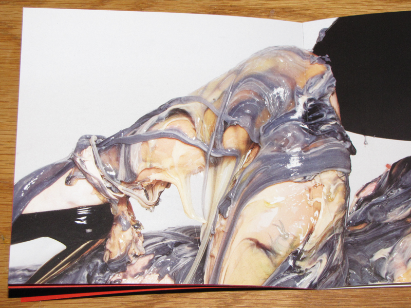
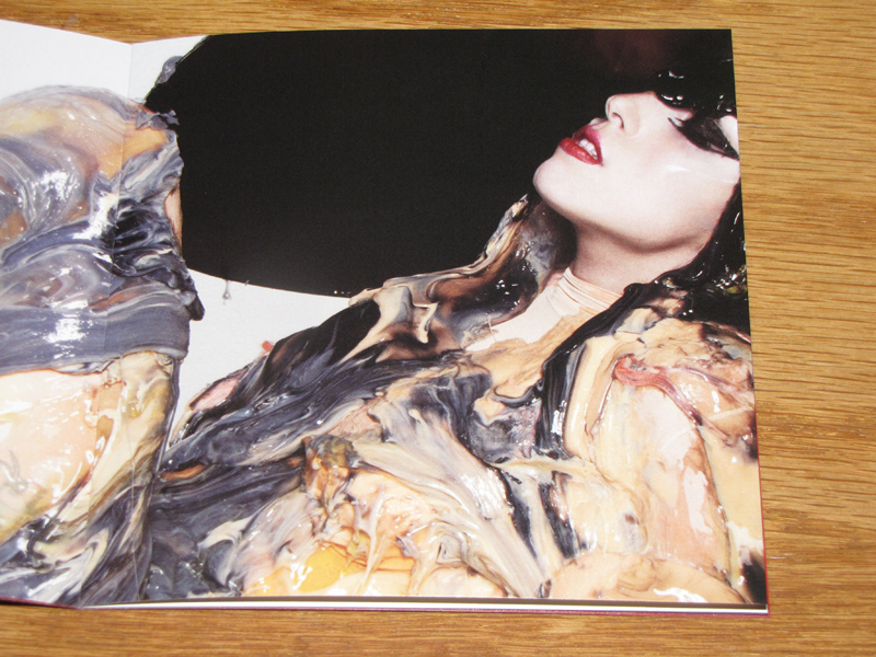
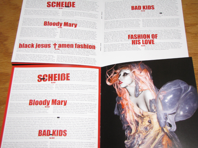
Now that the album is finally here, it actually makes sense. Not that it makes it any less ridiculous. Yet, as ridiculous and over the top as the album art is, the packaging for Born This Way is rather subtle. Various photos of Gaga show her in different poses with the horns on her head. Another shows her emerging from a sac/womb that is oddly beautiful. And the lyrics are all laid in either red or white pages. The end result is a really elegant package.
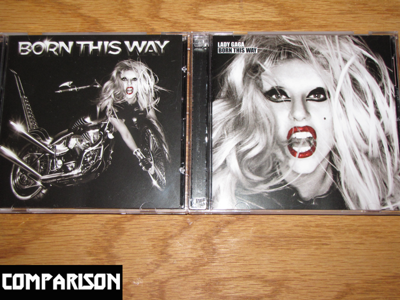
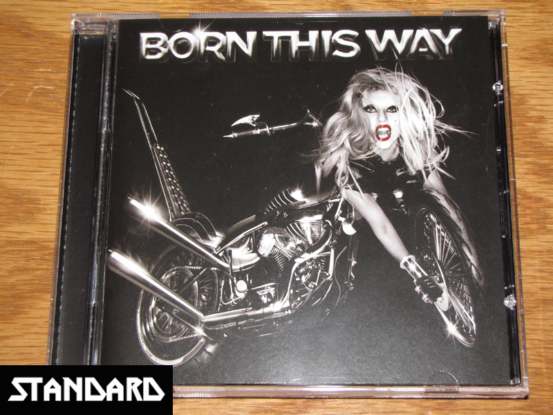
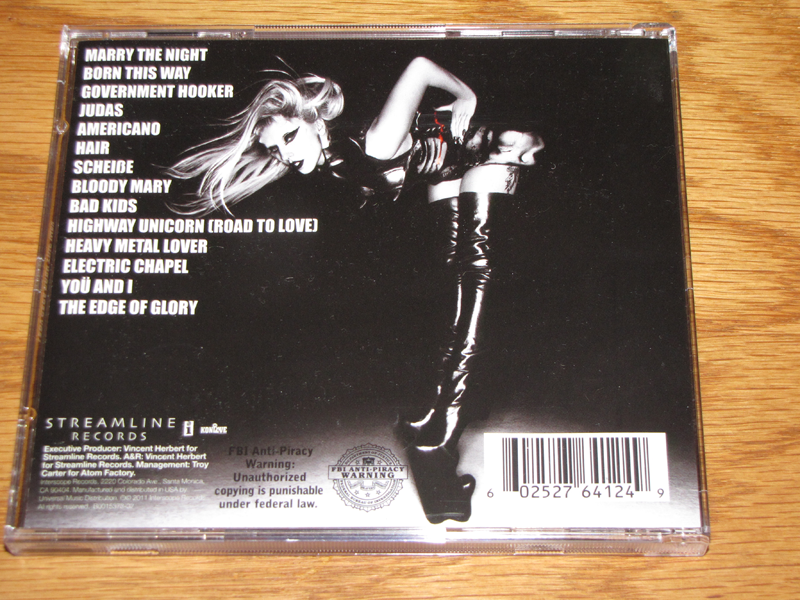
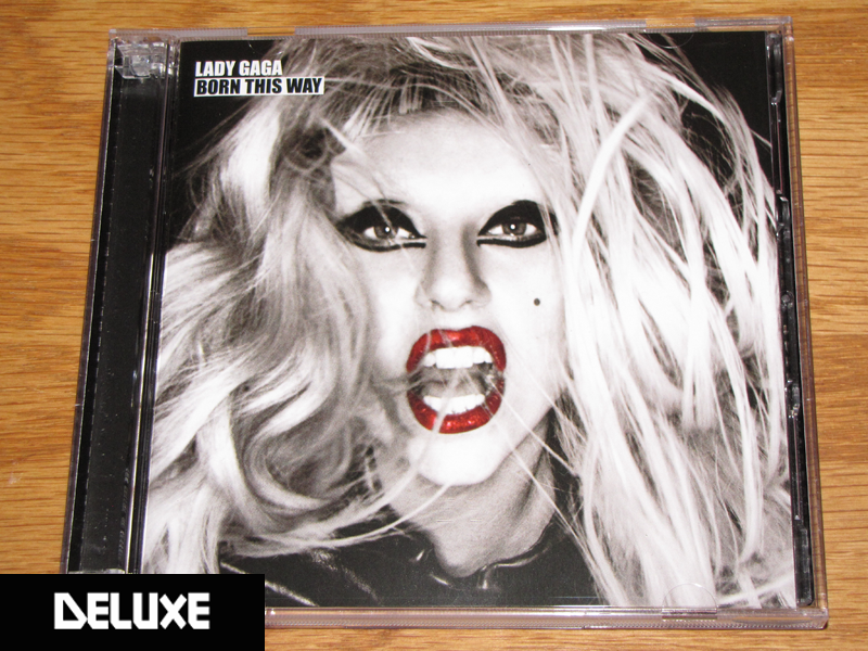
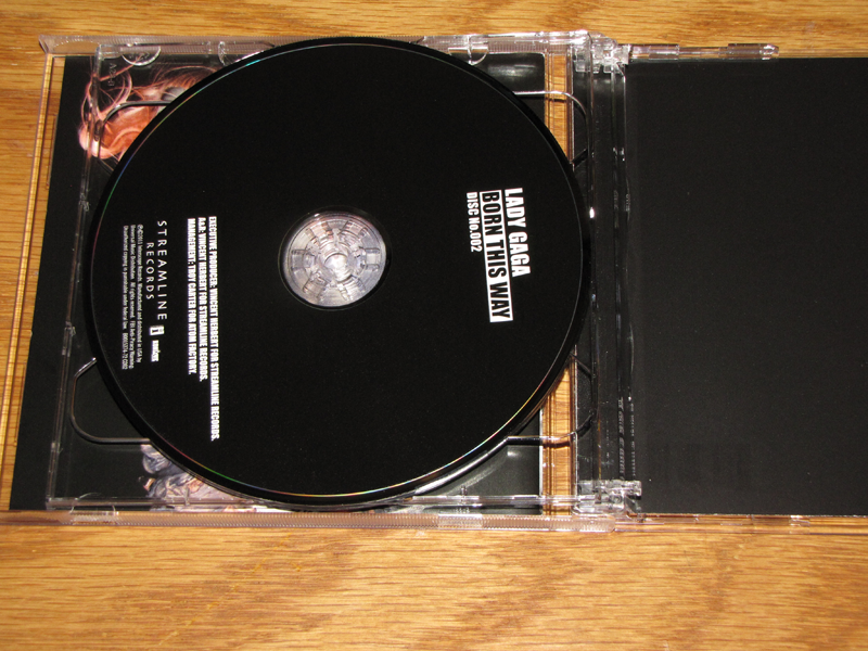
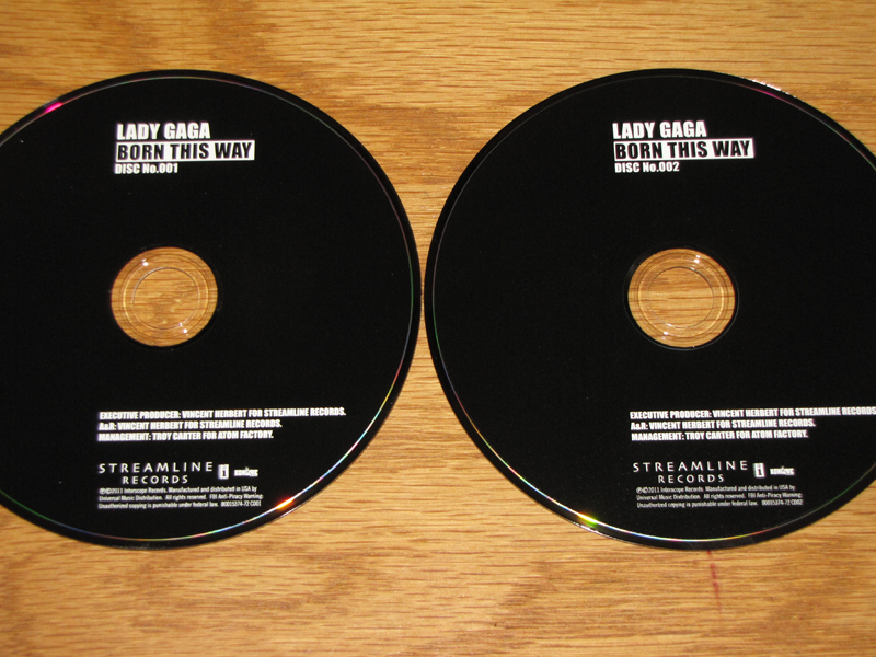
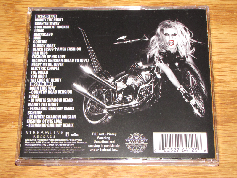
If you are torn between the Deluxe and the Standard Edition, the Deluxe only is only slightly different in regards to the packaging. For one, the album art on the Deluxe is not the same as the Standard. Instead of the Gaga/motorcycle art being on the front, it’s been moved to the back with the tracklisting, and the front art is a zoomed in picture of Gaga’s face. The Deluxe only has 2-3 extra pages in the lyric book, and it’s really only one picture that is expanded that is not included in the Standard. The Deluxe also has three more tracks added to the tracklist, and a bonus disc with five remixes. Besides that, the Deluxe is pretty similar in packaging, just with pictures rearranged in the order when compared to the Standard.
Verdict: The packaging is really solid, and worth the purchase. I would highly recommend the Deluxe edition; not only is the album art better, but it contains the track “The Queen,” which is really one of the best tracks on the whole album.